|
||||||||||||||||||
|
#16 | |||
|
Graphics Team
 Joined: Mar 2011
Posts: 62,782
|
Hmm... if black were to be used, I don't think it should be as dominant as that. Perhaps for links
 Also, Chelle, I did end up finding those pics in another spot. I think(?) the quality is decent. But you have already posted them in another link, so perhaps those could be used  Personally, I like that color palette #4493, but maybe mix some blues in too? Like from here. Or here? I was going to see if we could grab colors from some promo pics, but ones we've suggested may work  Does anyone have any preferences for character placement? I think Enid should obviously be next to Wednesday, but otherwise I don't really have a preference I don't think. __________________
Why did I ignore the truth? Jac || Join 9-1-1 ● Gotham ● The Wheel of Time Last edited by ice choco; 04-27-2023 at 08:26 AM |
|||

|
Reply With Quote |
|
#17 | |||
|
Fan Forum Star
 Joined: Nov 2010
Posts: 181,307
|
I don't post here anymore, but Tyler should definitely be on the banner.
As of colors. I really like the idea of purple. __________________
→ Jessica | creative dream |
|||
|
|
Reply With Quote |
|
#18 | |||
|
Moderator Support Team
 Joined: Jun 2014
Posts: 589,227
|
yeah I think Tyler and Thing should be included
as for the color scheme I think the #2570 that Chelle recommended is a good shade __________________
~Jen
The Fall Guy in theaters May 3rd My Art Thread *updated 4/24 |
|||
|
|
Reply With Quote |
|
#19 | |||
|
Graphics Team
Joined: Mar 2011
Posts: 62,782
|
Does anyone else want blue, or did you guys only want purples?
For me I'd prefer to have some blues too. But I'd like to know what you guys prefer. __________________
Why did I ignore the truth? Jac || Join 9-1-1 ● Gotham ● The Wheel of Time |
|||
|
|
Reply With Quote |
|
#20 | |||
|
Moderator Support Team
|
Blue would be nice too. to offset all the purple
__________________
Maurice |
|||
|
|
Reply With Quote |
|
#21 | |||
|
Moderator Support Team
Joined: Jun 2014
Posts: 589,227
|
that could work
__________________
~Jen
The Fall Guy in theaters May 3rd My Art Thread *updated 4/24 |
|||
|
|
Reply With Quote |
|
#22 | |||
|
Graphics Team Manager
 Joined: Sep 2009
Posts: 184,952
|
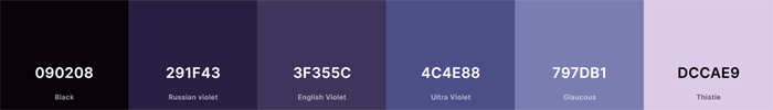
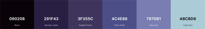
Can I suggest these? Or would you want more blue? (the first just has a softer purple tone, no blues)
    __________________
seems so long i've been waiting, still don't know what for, there's no point in escaping, i'm taking off my |
|||
|
|
Reply With Quote |
|
#23 | |||
|
Fan Forum Star
Joined: Oct 2003
Posts: 117,240
|
I definitely think black/gray should be used - maybe only as links text like Jac said.
I'm fine with Tyler/Thing being on the banner. I like the first and third color swatches you posted Chelle. |
|||
|
|
Reply With Quote |
|
#24 | |||
|
Cardcaptor Queen
Joined: Mar 2014
Posts: 42,175
|
Purple is my favorite color, so I'm a little biased lol. I like the idea of purple, blue, and black but since they said black is too harsh I would love purple and blue. I don't really mind placement, but I do think Enid should be next to Wednesday. Thing too if it can fit in there lol.
|
|||

|
Reply With Quote |
|
#25 | |||
|
Graphics Team
Joined: Mar 2011
Posts: 62,782
|
I personally like the 2nd and 4th ones
__________________
Why did I ignore the truth? Jac || Join 9-1-1 ● Gotham ● The Wheel of Time |
|||
|
|
Reply With Quote |
|
#26 | |||
|
Moderator Support Team
Joined: Jun 2014
Posts: 589,227
|
im with Tina, I like the 1 & 3 the best
__________________
~Jen
The Fall Guy in theaters May 3rd My Art Thread *updated 4/24 |
|||
|
|
Reply With Quote |
|
#27 | |||
|
Graphics Team Manager
Joined: Sep 2009
Posts: 184,952
|
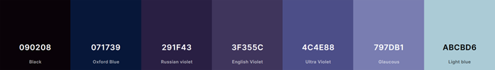
For the colour schemes #3 is going to give you a more darker feel than #1. Mainly because of the tone of the softest colour. #3 has the added dark blue shade (Oxford Blue #071739)so it would include blue while #1 doesn't have blue at all. So if you want to include blue I'd recommend going with that one if you like those colours. If you don't want blue but would like the darker feeling we can go with #1 but use the lightest colour (French Gray #B5C0D0) from #3 instead of the pale pink/purple shade (Thistle #DCCAE9). The French Gray is somewhere between a purple & a blue & a grey shade but it'll probably look more purple with the purples around it.
Now for #2 & #4 that has two shades of blue which would give you more blue. #2 just has the pale blue colour (Light Blue #ABCBD6) while #4 has the dark blue shade (Oxford Blue) & the pale blue shade (Light Blue). These possibly won't give you as much of a dark feeling as #3 would, but they'd give you more blue. If you wanted the two shades of blue & a darker feeling we could make that lightest colour a little more blue/grey in colour. Maybe something like this? 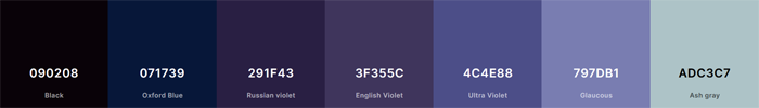 But it all depends on how much blue you want to include. Keep in mind that the lightest shade in the colour scheme is to be used as the background/base colour where you currently have the darker grey. So it wouldn't be used in a large space, but it could be used to break up the purple & give a little bit of variation/contrast. Going with #1 would do the same, but with the pinker shade instead. __________________
seems so long i've been waiting, still don't know what for, there's no point in escaping, i'm taking off my |
|||
|
|
Reply With Quote |
|
#28 | |||
|
Fan Forum Star
Joined: Oct 2003
Posts: 117,240
|
I'm fine with either.
|
|||
|
|
Reply With Quote |
|
#29 | |||
|
Moderator Support Team
Joined: Jun 2014
Posts: 589,227
|
I want some blue with the purple
__________________
~Jen
The Fall Guy in theaters May 3rd My Art Thread *updated 4/24 |
|||
|
|
Reply With Quote |
|
#30 | |||
|
Graphics Team
Joined: Mar 2011
Posts: 62,782
|
I like that last color scheme you posted Chelle
What does everyone else think?__________________
Why did I ignore the truth? Jac || Join 9-1-1 ● Gotham ● The Wheel of Time |
|||
|
|
Reply With Quote |
  |
| Bookmarks |
| Tags |
| board customization |
| Thread Tools | |
|
|


