|
||||||||||||||||||
|
#1 | |||
|
Elite Fan
Joined: Aug 2000
Posts: 31,323
|
Constructive Criticism / Tips Thread - A great way to learn and improve!
 ****This thread is to get constructive criticism and tips on how to improve your skill. This is NOT a praise thread (that's what the artist's thread is for), so of course you're allowed to post that you like the art but please let's keep it on topic. I know that at this board constructive criticism is welcome, but I hardly see it. Personally, I love when I get constructive criticism for my arts (though I rarely do). To be honest, I'd rather get criticism than praise  I think that it can do nothing but help me on my next art. So, I thought that I would start a thread. Please remember to keep your criticism constructive I think that it can do nothing but help me on my next art. So, I thought that I would start a thread. Please remember to keep your criticism constructive ") Also, you may not post someone else's art for criticism. Also, you may not post someone else's art for criticism.I hope that you will allow me to start by posting one of my arts. I am not pleased with how it turned out, I feel that it has the potential to be better, but I don't know how.  There is just something that I am not satisfied about with it  Maybe its the text... Maybe its the text...Last edited by Si_Crazy; 04-20-2018 at 06:48 PM |
|||

|
Reply With Quote |
|
#2 | |||
|
Elite Fan
 Joined: Sep 2005
Posts: 31,100
|
Yeah, I think it's a problem with the text. However, I'm not big with texts myself, so take my advice with a grain of salt: I think it's too big, maybe you could make it smaller and put an even smaller quote beneath it. I think that might make it better.
BUT, what I really like about your art is the way you cut her out of the background. Especially since you even kept the earrings which must have been hard to do All in all I think it is a wonderful piece, but you are right, I think it's the text that makes it weird... __________________
|
|||
|
|
Reply With Quote |
|
#3 | |||
|
Fan Forum Hero
Joined: Dec 2002
Posts: 78,593
|
It kinda looks as though the background is really separate from the rest of it, maybe you could add a tint from the photo colour into it.
__________________
Wifey Jen O'Neill With 2 L's!
 |
|||
|
|
Reply With Quote |
|
#4 | |||
|
Master Fan
Joined: May 2002
Posts: 19,675
|
I don't really believe in criticism (
 ) unless a person specifically asks for it.Why? well, because everyone sucks at first and then the only thing that someone can help you with is the "technical" stuff...when it comes to aesthetics, tastes differ... ) unless a person specifically asks for it.Why? well, because everyone sucks at first and then the only thing that someone can help you with is the "technical" stuff...when it comes to aesthetics, tastes differ...I think art is good as long as it makes you happy  __________________
( * )
|
|||
|
|
Reply With Quote |
|
#5 | |||
|
Master Fan
Joined: May 2002
Posts: 19,675
|
yeah, I just realized this doesn't make much sense but it's late here and i'm going to bed
__________________
( * )
|
|||
|
|
Reply With Quote |
|
#6 | |||
|
Elite Fan
Joined: Aug 2000
Posts: 31,323
|
Tihana, I agree with you, when you say that it depends on taste
But sometimes I have no idea why I don't like it, and I would love to get someone to suggest a new way to jazz it up So, according to your taste, how would you change it? ") Jen/Lynn, thanks for those suggestions! Now where is my image file?!  What if I add some shiney glowy things.. Last edited by 4N6 DNA; 02-04-2008 at 03:26 PM |
|||
|
|
Reply With Quote |
|
#7 | |||
|
Master Fan
Joined: May 2002
Posts: 19,675
|
I wouldn't change much, maybe add some whiteish texture to the bottom right to give the whole thing a hint of wavy..something
__________________
( * )
|
|||
|
|
Reply With Quote |
|
#8 | |||
|
Part-Time Fan
Joined: Jul 2005
Posts: 153
|
You cut it perfectly but what I think is wrong maybe the texture and text..I know this texture and I like it but the thing is sometimes to work out try to use a texture with a similar colouring of your image or a little darker so that the image stands up with the text don't make it to big try to keep it to a medium or small size.
__________________
Andreina
My LJ |
|||
|
|
Reply With Quote |
|
#9 | |||
|
Elite Fan
Joined: Aug 2000
Posts: 31,323
|
Im gonna give your tips a go
|
|||
|
|
Reply With Quote |
|
#10 | |||
|
Fan Forum Star
Joined: Oct 2003
Posts: 117,242
|
Anyone wanna have a go at this? It's a good idea, Jessie.
Is it sad that I feel like I don't have any art that I dislike? I wouldn't put anything online if I didn't like it...  |
|||
|
|
Reply With Quote |
|
#11 | |||
|
Fan Forum Star
Joined: Sep 2007
Posts: 131,188
|
Can we post icons?
I'm not to sure about the colouring I did with this one? __________________
Well I'm sure the guy's out there somewhere. |
|||
|
|
Reply With Quote |
|
#12 | |||
|
Master Fan
Joined: Dec 2006
Posts: 19,743
|
I would make it less yellow, maybe a bit more blue? If you can't do that, I would try making it brighter, and that'll make the yellowness go away
 |
|||
|
|
Reply With Quote |
|
#13 | |||
|
Fan Forum Star
Joined: Oct 2003
Posts: 117,242
|
Courtz_BV: I'm sure we can use all sizes of arts here.
I agree with Mimi. I would give it some textures to pretty it up... and maybe some text. Okay okay, I might have one: 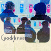 |
|||
|
|
Reply With Quote |
|
#14 | |||
|
Elite Fan
Joined: Aug 2000
Posts: 31,323
|
Tina, the theme of your icon seems to be three sections and then the text. Maybe accentuate the sections? Make each different. maybe black and white one, colorful one, and a dark one, or something to distinguish the three, make them each stand out differently, especially because they are the same picture
And maybe put borders around each box to further that Courtney, I think the coloring is great on that! Certainly what Mimi and Tina said. And as for textures I agree with Tina too. To elaborate; Since there is a lot of space on the left, from the back of his head, and the bottom right, something maybe like this:  + +  (lighten this layer) = (lighten this layer) =  Puts a kind of subtle light on it As I just got finished telling Rella, I  light textures light textures |
|||
|
|
Reply With Quote |
|
#15 | |||
|
Fan Forum Star
Joined: Sep 2007
Posts: 131,188
|
Thanks so much guys
 I will try all your suggestions out when I get home later. I will try all your suggestions out when I get home later.__________________
Well I'm sure the guy's out there somewhere. |
|||
|
|
Reply With Quote |
  |
| Bookmarks |
| Tags |
| fan art board |
| Forum Affiliates | |
| Thread Tools | |
|
|


