|
||||||||||||||||||
|
#1 | |||
|
Elite Fan
Joined: Aug 2000
Posts: 31,323
|
FanArtist Block - Suggestion / Help Thread
Sometimes making arts flows with me, i can get one done in stellar time, but sometimes I get an idea and like it but its hard to followthrough cause i get stuck for ideas. I thought maybe we could put our unfinished work here to get some ideas
") I have been working on this this morning but i feel like it is too light or something. Im just not please with it. Any ideas on what i can do with it? Maybe a filter or how i should do words? 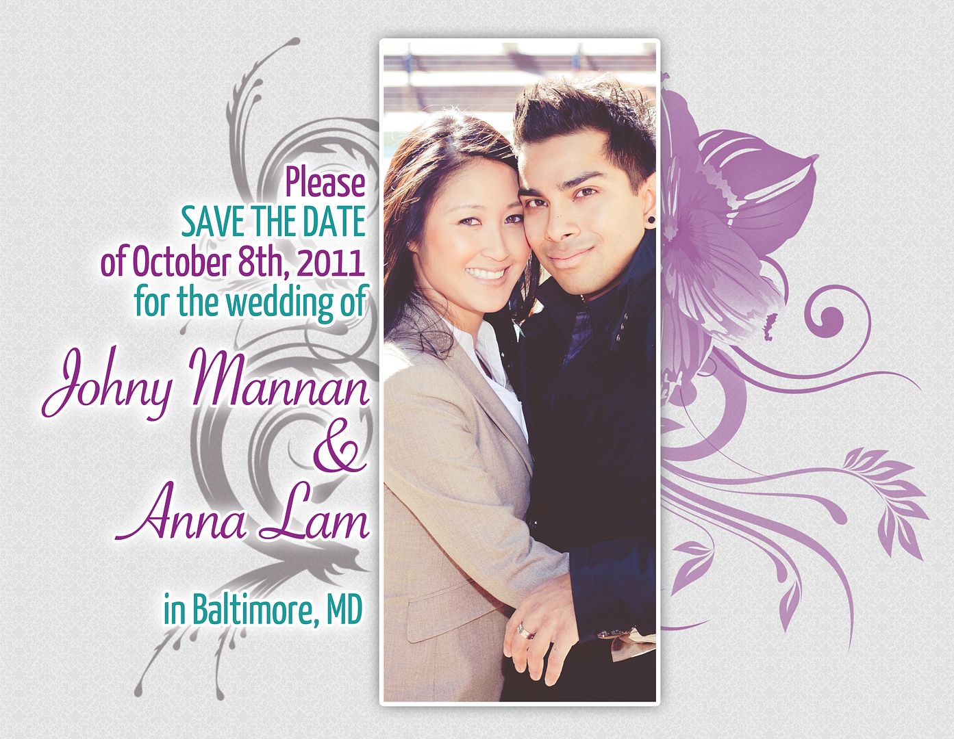 Any ideas? |
|||

|
Reply With Quote |
|
#2 | |||
|
Loyal Fan
 Joined: Mar 2005
Posts: 1,731
|
maybe rather than making the top and bottom bar brightened - you can make them standout by making them black & white, or perhaps another color like blue toned.
__________________
Jensen Ackles|Buffy|Angel|Ewan McGregor|The Office|Supernatural  BAngel BAngel avatar by me "You stink like sex." -Dean Winchester |
|||
|
|
Reply With Quote |
|
#3 | |||
|
Fan Forum Hero
Joined: Dec 2002
Posts: 78,593
|
I find that listening to music helps... oh and if your art is based on an episode, try watching the episode for inspiration.
 __________________
Wifey Jen O'Neill With 2 L's!
 |
|||
|
|
Reply With Quote |
|
#4 | |||
|
Elite Fan
Joined: Aug 2000
Posts: 31,323
|
thanks for the great tips. I'll work on those
I am making a collage for my friend who just got married. Any ideas for any filters (maybe some fuzzy white? I cant get glare to work right for me..) and possibly some wedding fonts? |
|||
|
|
Reply With Quote |
|
#5 | |||
|
Fan Forum Hero
Joined: Dec 2002
Posts: 78,593
|
Have you tried googling pics of 'lace' that might make a nice texture
 __________________
Wifey Jen O'Neill With 2 L's!
|
|||
|
|
Reply With Quote |
|
#6 | |||
|
Elite Fan
Joined: Aug 2000
Posts: 31,323
|
I wish I could find my file for that greys art! I've improved the last few months and want to play with it!
  As for the wedding pic, I decided to go texture less, very simple, some drop shadows and gaussian blurs This is how it turned out So I need help. I have been working on this chuck art, but I am stuck. Any suggestions? I am not happy with the background, but I don't know what to fill it with    |
|||
|
|
Reply With Quote |
|
#7 | |||
|
Fan Forum Hero
Joined: May 2007
Posts: 92,295
|
The wedding art is beautiful
You could maybe just fill the background with a color that you think would fit or search for a other background texture that you do would like. __________________
|
|||
|
|
Reply With Quote |
|
#8 | |||
|
Elite Fan
Joined: Aug 2000
Posts: 31,323
|
Found another background texture! Case close, the finished piece:
 What do you guys think? I threw on some drop shadows and threw on some spy stuff |
|||
|
|
Reply With Quote |
|
#9 | |||
|
Part-Time Fan
Joined: Feb 2008
Posts: 308
|
 does the background suit the images, cos i thought it looked good but i'm not too srue now? :S and any suggestions for the text, like what font? because i am completely clueless at the moment lol thank you __________________
icon: Edelyn It is a beginning not an end. JulianPeyton LuasPeyton ChuckBlair EdwardCullen ♥ |
|||
|
|
Reply With Quote |
|
#10 | |||
|
Elite Fan
Joined: Aug 2000
Posts: 31,323
|
That looks wonderful! I think the background suits just fine because it is very colorful. Matches the images. What if you put a drop shadow on the images, like a black or white one to make the images stand out a bit more, and not blend in with the background?
As for the font, if you are planning on putting the text over an part of the images, then I would suggest a big boxy font, it would stand out more. but a simple thin one would work if you were going to put it over the background There are thousands of free fonts here at dafont. You could start there Please let us know how it turns out, or if you want a different suggestion  |
|||
|
|
Reply With Quote |
|
#11 | |||
|
Part-Time Fan
Joined: Feb 2008
Posts: 308
|
I don't think I've taken so much time in anything before LOL
anyway this is how it turned out: 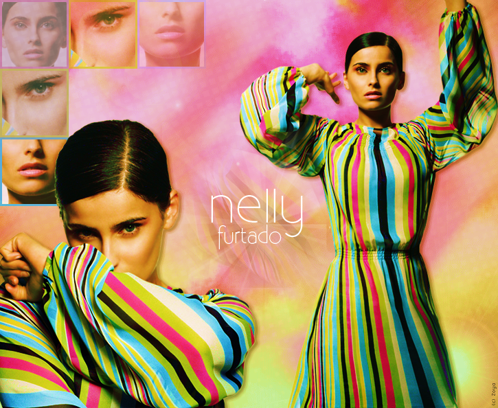 not sure what i think, i like it but i'm still not sure, tell me what you think of it and thanks for all your help __________________
icon: Edelyn It is a beginning not an end. JulianPeyton LuasPeyton ChuckBlair EdwardCullen ♥ |
|||
|
|
Reply With Quote |
|
#12 | |||
|
Elite Fan
Joined: Aug 2000
Posts: 31,323
|
how about making those boxes on the left not transparent?
So does this look like the pictures were taken when they were younger? If not, how can I emphasize that?  |
|||
|
|
Reply With Quote |
|
#13 | |||
|
Fan Forum Hero
Joined: May 2007
Posts: 92,295
|
Jessie, I would definitely believe that those pictures where taken when they where younger and it looks like that too.
__________________
|
|||
|
|
Reply With Quote |
|
#14 | |||
|
Elite Fan
Joined: Aug 2000
Posts: 31,323
|
Cool, thanks! i value your opinion
|
|||
|
|
Reply With Quote |
|
#15 | |||
|
Fan Forum Hero
Joined: May 2007
Posts: 92,295
|
Your welcome
 __________________
|
|||
|
|
Reply With Quote |
  |
| Bookmarks |
| Tags |
| fan art , fan art board |
| Forum Affiliates | |
| Thread Tools | |
|
|


